Component Kit
Explore the UI controls, form inputs, navigation elements, data views, and landing sections available in the visual editor. Switch categories below or preview across brand themes.
Typography & Content
Headings, body copy, inline elements, buttons, lists, tables, and media primitives
Text
Plain inline text run without a wrapper element
Plain text node
Span
Styled inline phrase inside a sentence
Highlighted tag
Link
Anchor with internal or external destination
Icon
Scalable inline SVG mark with customizable size and color
Divider
Horizontal rule separating content groups
Line Break
Hard line break within a text flow
548 Market Street
Suite 400, San Francisco
Suite 400, San Francisco
Empty Box
Visual spacer or placeholder surface
Custom HTML
Embeds raw HTML markup directly into the page
⌘K command menu
Image
Responsive image with lazy loading and alt text

Heading
Section titles from H1 through H6 with typographic scale
Designed for clarity at every scale
Paragraph
Multi-sentence body copy with comfortable reading measure
Interfaces read best when chrome stays quiet and hierarchy comes from spacing and contrast rather than heavy weights.
Rich Text
Formatted prose with bold, emphasis, links, and inline code
Supports bold emphasis, italics, underlines, and inline
code.List
Ordered or unordered item lists
- Role-based access control per organization
- Multi-currency pricing and localized routes
- Automated backups and audit trails
Table
Structured data table with header, rows, and aligned numeric cells
| Workspace | Plan | Members | Monthly spend |
| Northwind Labs | Enterprise | 48 | $2,400 |
| Linear Studio | Pro | 14 | $406 |
| Raycast Team | Pro | 9 | $261 |
Layout
Flexbox, fractional columns, 12-column grid, containers, landmarks, and data repeaters
Flex Row
Horizontal flex group with configurable gap and alignment
Flex Column
Vertical stack with consistent spacing between children
Container
Centered max-width wrapper with inner padding
Centered max-width container
Columns
Fractional column split such as 2 : 1 or 1 : 1 : 1
Row & Column
12-column responsive grid system (4 + 8 span shown)
Region
Semantic HTML landmark such as aside, nav, or section
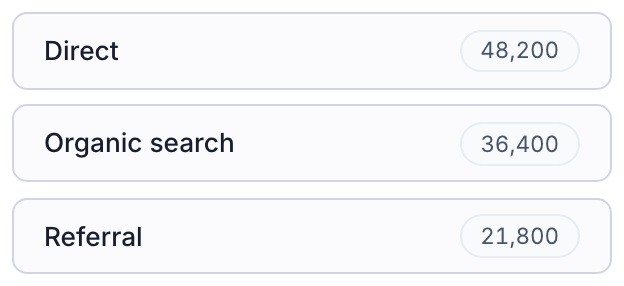
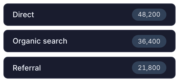
Repeater
Binds a collection and repeats its template per item, with an empty state fallback
Brand & Switchers
Identity marks, dynamic copyright tokens, and user preference toggles
Logo
Brand mark that adapts to light and dark themes automatically
Dynamic Text
Resolves live tokens such as current year and application name
© 2026 Site Knock Demo. All rights reserved.
Social Icons
Links to social profiles with brand icons


Theme Switcher
Switches between light, dark, and system color schemes
Language Switcher
Changes the active display locale
Currency Switcher
Converts displayed prices to the selected currency


Density Switcher
Adjusts interface spacing and typography scale
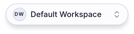
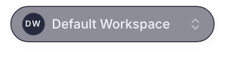
Organization Switcher
Switches the active workspace for signed-in members
Switchers Group
Combined toolbar housing all enabled preference switchers
Navigation & Alerts
Menus, account flyouts, notification inbox, and live coupon availability
Horizontal Menu
Top navigation bar with optional icons and active link styling
Vertical Menu & Section
Sidebar link stack paired with a section heading label
Profile Flyout
Account avatar menu with profile and sign-out actions
Notification Bell
Popover inbox icon with unread counter badge
Mobile Nav Toggle
Hamburger button that opens the drawer on small viewports
Notifications Feed
Stream of recent announcements with dismiss controls
Recent updates
Coupon Availability Banner
Displays remaining redemptions for a live promotional code


Sidebar
Collapsible navigation rail used in dashboard layouts
Forms & Inputs
Standard HTML form controls and rich pickers for dates, phones, currencies, files, and signatures
Toggle Switch
Immediate on/off setting switch
Checkbox Field
Single boolean confirmation field
Star Rating
Interactive 1–5 star score selector
Range Slider
Draggable numeric value slider
40
Native Checkbox
Standard HTML checkbox input
Native Radio
Single radio option button
Field Label
Standalone caption for custom inputs
Form Button
Submit trigger for an enclosing form
Verification Code
Segmented one-time passcode input
Text Input
Single-line input supporting text, email, password, or number types
Text Area
Multi-line text box for notes, descriptions, or messages
Select Dropdown
Native select menu with labeled option values
Searchable Combobox
Filterable dropdown with keyboard navigation
Checkbox Group
Multi-select checklist returning an array of chosen values
Radio Group
Mutually exclusive option list
Date Picker
Calendar popover for choosing a single date
Date Range Picker
Start and end date selector for reporting windows
Time Picker
Hour and minute selector
Date & Time Picker
Combined calendar and clock selector
Country Picker
Searchable ISO country selector with flags
Timezone Picker
IANA timezone selector grouped by region
Phone Input
International phone number field with country dial code
Currency Input
Formatted monetary amount input
$
Lookup Field
Async search picker backed by a collection or static options
File Upload
Drag-and-drop dropzone with file type and count constraints
Signature Pad
Canvas for capturing a drawn signature
Address Fields
Composite street, city, state, postal code, and country fieldset
Form Container
Complete form wrapper with submission handling and status feedback
Charts & Media
Collection-bound charts, hero carousels, and video players
Chart
Bar, line, area, or pie chart bound to a collection
Monthly revenue by channel
Carousel Slider
Multi-slide hero carousel with transitions, arrows, and pagination dots
Video Player
Inline HTML5 or embedded video with playback controls
Page Sections
Ready-made landing and marketing sections for public pages
Hero
Opening banner with headline, supporting copy, and primary/secondary actions
Stats
Key metric callouts with tabular figures and icons
Features
Multi-column capability grid with Lucide icons
Benefits
Value proposition cards highlighting customer outcomes
Pricing
Plan comparison table with highlighted tier and feature checklist
Testimonials
Customer quotes with author attribution and star ratings
Card Grid
Editorial or blog card grid with tags and cover images
FAQ Accordion
Collapsible question-and-answer list
Team Directory
Member profile cards with role, bio, and social links
Logo Marquee
Continuous horizontal ticker of partner or customer logos
Image Section
Featured visual with caption and aspect ratio control
Video Section
Section-level video showcase with heading and aspect ratio
Location & Contact
Office address, hours, and contact details
Call to Action
Closing conversion banner with primary and secondary actions
Marketing Footer
Multi-column site footer with brand summary, link groups, and legal links